Thursday, June 29, 2017

Infiniti's Window Profile Theme

Three years ago I wrote about reverse-angle or "dogleg" C-pillars, among other things commenting on a variation that Infiniti stylists had come up with.

We now know that the design is being used as a brand identification theme, finding it on about half of Infiniti's current lineup and likely to spread to the rest when they are redesigned.

I consider visual brand identity cues a good thing.  Many upscale brands have taken great care to devise them and retain them over many decades.  In the past, brand identity was handled by the design of the grille (Rolls-Royce, Packard, etc.), but there is no reason why other areas of a car can't be used (Cadillac's late 1940s and 1950s tail fins).

I think what Infinity is doing seems a bit contrived and fussy.  But the whole point is for it to stand out from the rest of the automobile crowd, so there isn't much to complain about, especially when contrasted with Lexus' assertive double-L grilles.

Gallery

2016 Infiniti QX60
On this SUV, the kink is near the upper part of the window.

2017 Infiniti Q60
But on this sports car, it is farther down and stretched out.

2017 Infiniti QX30
The kink rides lower in this smaller SUV.  However, the window shape is not involved -- the theme is carried out using a piece of chrome trim.

2018 Infiniti Q50
Here is the latest sedan version.  The actual C-pillar is only slightly curved at the window, the kink effect being largely carried out via the chromed trim.
Read More

Monday, June 26, 2017

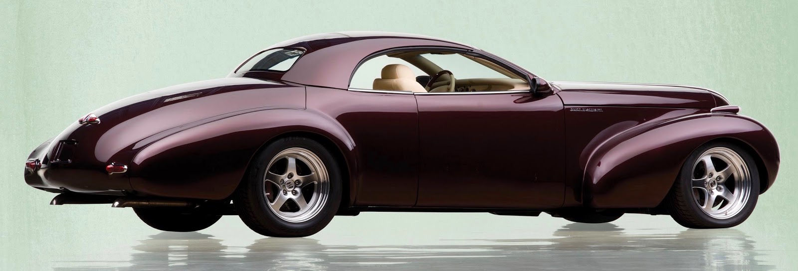
Buick Blackhawk Concept: 1939 Parts Included

Many concept or auto show cars have unique, custom-built bodies.  Others intended to preview features on forthcoming production cars might be based on some production or prototype body components.  But so far as I know, only one show car from a major manufacturer used some production body parts from more than 60 years perviously.

That car was the Buick Blackhawk, announced late 2000, first displayed early in 2001, and linked to Buick's 100th anniversary in 2003.

The Blackhawk used the grille from a 1939 Buick and some parts from later models, though the design other than the grille was essentially new.  I found no single source providing a nearly complete version of the Blackhawk's background, though various aspects are discussed here, here, here, and here.

The Blackhawk's concept theme is that of a "street rod" of the late 1940s, but with 2000-vintage details such as the wheels.  Most of the photos below are either factory shots or are from auction houses publicizing its availability -- I'm not sure of most of the sources.  The street view of a '39 Buick is one I took.

Gallery

General view of the Blackhawk.  I think it is nicely shaped, in part because stylists were familiar with 1940s design conventions.  That is, they simply had to refine rather than innovate.  I dislike the 2000-vintage wheels because they strike me as being out of character with the rest of the car.

This view from the rear shows the hot rod inspired dual exhausts.  The tail lights and the brake light + badge on the trunk lid are from 1946-48 production Buicks.

A slightly rear-oriented side view.  Adding street-legal bumpers would have degraded the purity of the design.  RM Sotheby's photo.

The top retracts.  Here it is in its raised position.

Now it's halfway lowered.

And here it is in its down position.

Front view showing the 1939 Buick grille and badge.

A 1939 Buick front end.

Finally, a 1939 Buick Special Convertible Coupe.  Below, I repeat the image of the Blackhawk in the first photo for comparison.


Read More

Thursday, June 22, 2017

Concept to Production: Oldsmobile to Dodge ?!?

The 1992 Oldsmobile Anthem was a concept car that is little known today and was not very noteworthy in its time.  Supporting this contention, there are few Internet links dealing with it.

I came across an image of it while researching another Oldsmobile concept car and was struck by how closely its design theme reminded me of early 1990s Chrysler Corporation LH automobiles, especially the Dodge Intrepid that first appeared as a 1993 model.

Many concept cars are thinly disguised versions of soon-to-appear production models.  But the Anthem seems like a case where one company's concept car previewed another company's production job.

I don't think that's what happened intentionally.  But still ...

Gallery

1992 Oldsmobile Anthem side view.

1993 Dodge Intrepid side view.  The cars seem most similar when seen from the side.  The greenhouse fenestration is strikingly similar, minor details aside.  Even the front and rear designs are fairly close, though the Intrepid has more overhang.  Note the relationships of the backlights (rear windows) to the rear wheel openings.  Especially note how the rooftop interacts with the C-pillar on both cars.

Anthem front.

Intrepid front.  Concept car grilles often differ from production versions, so we see that here.  But the headlight housings are similar in spirit.

Rear view of the Anthem.

Rear 3/4 view of an Intrepid.  Again, differences can be expected here.  The quality of the Anthem image is poor in the area of the backlight, but the trunk/backlight design is not far from the Intrepid's.
Read More

Monday, June 19, 2017

The Cluttered Toyota C-HR

The Toyota C-HR is a small vehicle suffering from over-decoration: yet another Styling Crime.  Previous similar examples I've written about include the Nissan Juke and the BMW i3.

A brief Wikipedia entry on the C-HR dealing with its international production status is here.   And a not-very-favorable reaction by Motor Trend magazine is here, in which it is noted that "C-HR stands for 'Coupe-High Rider,' and it’s neither."

Let's consider its styling.  Generally speaking, it is one more example of Toyota over-reacting against criticism of its cars' styling being too bland.  The result is a confusing mess.

Gallery

I have to admire the Toyota engineers responsible for the body stampings.  Note the door cut lines and how they cross the various bulges and creases while not interfering with the shapes of same.  The Motor Trend article linked above criticized the small windows on the rear doors, mentioning that they made it difficult for back-seat passengers -- especially children -- to see out.
Try imagining the C-HR without all the visual jazz but with the same windows.  The underlying shape would have too much of a flat, empty surface aft of the center door cut -- the only cure being enlargement of the windows.  Yet the small windows have the "advantage" of reducing the car's weight and thereby enhancing fuel economy.

The side bulges that mimic separate fenders are linked by an Art-Nouveau curved bulge and a plastic protection panel lower down.  I suspect the design might have been improved if the separate fender scheme had been altered to eliminate the swoopy connection zone.

Given that the C-HR is a hatchback, it is interesting to observe the upper part of its cut line as it crosses over the top by the aerodynamic lip over the back window.  The upper curve of the side window line continues towards the rear of the car in a nice way.  I would have considered extending the rear side windows farther aft to coordinate more with the upper edge of the back window, styling cliché that it might be -- though perhaps Toyota stylists chose to avoid that.

The front is similar to other Toyotas, therefore providing some useful brand identity.  Its theme is better integrated than that of the rest of the car, though the effect strikes me as being slightly too heavy-looking.
Read More

Thursday, June 15, 2017

Concept to Production: Alpha Alero to Oldsmobile Alero

Some concept cars are pure fantasies intended to keep styling staff juices flowing.  Back in the 1950s, they were appropriately called "dream cars."  In recent decades, many concept cars displayed on the auto show circuit are thinly disguised versions of cars due to be marketed in another year or two.  One reason for their existence is to condition the buying public to new design features.  Another might be to get the buying public's negative reactions to details that might be easily modified in the months before introduction of the production car.

Currently, both concept cars and production cars usually are, in my opinion, overly-decorated in terms of both body sculpting and angular, sometimes spikey shapes for grilles, headlight and tail light assemblies, and even window profiles.  With all that happening, sometimes it can be difficult to evaluate differences between the styling of a concept car and the production car it is intended to "predict."

Back in the late 1990s, General Motors' styling emphasized shape rather than ornamentation.  Because of this comparative (to present times) simplicity, I though it might be interesting to examine the Oldsmobile Alero, introduced for 1998 and how it differed from the 1997 Alero Alpha concept car that previewed it.

Gallery

A 1998 Oldsmobile Alero coupe.

Side view of the Alpha.  Although it differs from the Alero in every detail -- especially note the front overhang -- the two designs are clearly related in spirit.  Examples include the side window shapes, the trunk area's relationship to the curve of the top, the side parts of the tail lights, and the sense of the fender line (despite the Alpha's stubbier nose).

Alero front end treatment.

Here the Alpha is much closer to the production Alero.  Details of the hood cut, the headlight assembly outline, the shapes of the three openings below the bumper strike panel, the strike panel itself -- all differ, but not greatly.

This frontal theme was already in place for Oldsmobile in the form of its Aurora sedan introduced in the spring of 1994.

In turn, the Aurora's front design evolved from a 1989 concept  called the Tube Car.

Rear 3/4 view of a 2000 Alero.

The Alpha's rear design is close to that of the production car above the bumper -- note the shapes of the tail lights and license plate zone.  Sub-bumper styling differs considerably.  For what it's worth the Alpha's gas cap is on the left side, whereas the Alero's is one the right.
Read More

Monday, June 12, 2017

Porsche 928

According to Wikipedia, Porsche 911 sales were falling in the early-to-mid-1970s.  Management became concerned that the line had about completed its run, and that a replacement was needed.  Rear and mid engine locations were ruled out for various reasons mentioned in the link.  The option chosen was a V-8 motor in the front driving the rear wheels.

This drastic, non-Porsche layout shocked fans of the marque even though they had received some advanced notice in the form of similar (though lesser) Porsche 924.  Production of 928s began in 1977 and marketing started in 1978, the line remaining on the market into 1995.  Ironically, 911 versions continue to be built and sold to this day.

Gallery

Auction photo of a 1978 Porsche 928.  The nose retain a whiff of the feeling of 911s, but the rest of the car contains new design language partly shared with the 924.  The styling is difficult to fault.

A for-sale photo of a 1978 928.  The high roofline curve was required because 928s had a 2+2 seating arrangement (though the rear seating was fit only for small children).

Same car: trunk lids were not practical, given the packaging, so access was by hatchback.

As with Porsche 914s and 924s, headlight housings pivoted upwards when the lights were tuned on.  This caused aerodynamic disturbances.  Made the car look ugly, too.  I do not have a source for this photo, available on many web sites.
Read More

Thursday, June 8, 2017

Ford Taunus: The First Generation

As this Wikipedia entry mentions, Ford's German subsidiary introduced "a mid-size car intended to slot into the range between the little Ford Eifel and the company’s big V8 models."  Moreover, "It was the first car developed at Cologne by Ford Germany which previously had built cars originated by Ford businesses in the US or the UK."  Production began at the end of April 1939 and it was first exhibited in June.  Germany invaded Poland on 1 September, so Ford's timing was unfortunate.

Unlike the USA, wartime civilian automobile production was not quickly halted in Germany.  Taunus cars were built as late as February 1942.

Production resumed a few years after the war with a slightly changed version.  Model identifiers for this first generation of Taunus cars were G93A (1939-1942), and G73A (1948-1952).  A redesigned Taunus line appeared in 1952.

Wikipedia asserts that the Taunus was developed in Köln, but styling was adapted from Ford's 1939 De Luxe Tudor models that, in turn, were facelifts of a body introduced for the 1938 model year.

Gallery

A 1939 Taunus.

Here is a 1939 Ford De Luxe Tudor.  It is larger than the Taunus in virtually all respects, so the Taunus can be considered a shrunken '39 Ford.  Aside from altered proportions and size, salient differences are the Taunus' lack of flat running boards and its use of rear-hinged "suicide" doors.  Oh yes ... and the grille bars are not vertical.

Rear 3/4 view of a '39 Taunus.

This is a postwar Taunus.  Changes I note are new grille bars and the addition of a turn signal wand just aft of the door.

A later postwar Taunus.  It features a different bumper, and more chrome trim on the sides and framing the windshield.  Linking the fenders is something that might be either a sheet metal strip or a partly enclosed running board.
Read More

Monday, June 5, 2017

Airflows, Large and Smaller

Chrysler Corporation's aerodynamically-influenced Airflow body design was a marketplace failure.  Despite that, it was highly influential in the American automobile industry.  References to Chrysler and DeSoto Airflows are here and here.

One new engineering feature was all-steel bodies (aside from a roof panel) built up from a frame structure attached to what amounted to a chassis.  To put it another way, Airflow bodies approached, but didn't qualify as, unitized construction that since then has become the norm.

At any rate, for launch year 1934 Chrysler produced Airflows in three basic body types (four-door sedans, two-door sedans, and coupes) and for the 4-door sedans, five different wheelbase lengths.  Wheelbases in ascending order are -- DeSoto: 115.5 in (2934 mm); Chrysler CU: 122.8 in (3119 mm); Chrysler Imperial CV: 128.0 in (3251 mm); Chrysler Custom Imperial CX: 137.5 in (3492 mm); and the Chrysler Custom Imperial CW: 146.5 in (3721 mm).

What we have, then, is a wheelbase range of 31 inches (787 mm) -- a huge difference for one line of cars.  Coupling that with the various body types, Chrysler Corporation launched a wide variety of Airflows.  Here are examples.

Gallery

This is a 1934 CU Chrysler Airflow.  It can be considered the baseline model for comparisons.

The largest '34 Airflow was the CW Custom Imperial  8- passenger sedan that featured a curved windshield -- the first for an American production car.

All 1934 DeSotos were Airflows, Chrysler retaining conventional bodies for its 6-cylinder cars.  This is the four-door sedan.

Here is a two-door DeSoto sedan for 1934.

Then there were coupes.  The smallest, due to its short wheelbase was this 1934 DeSoto (Bonhams auction photo).

* * * *   Some Side Views  * * * *

1934 Chrysler CU, Bonhams photo.

Advertisement photo featuring a 1934 CW Custom Imperial.  The background is the Park Avenue entrance to the Waldorf-Astoria hotel.

An in-motion Bonhams auction photo of a '34 DeSoto Airflow Coupe.

A brochure page for the 1934 DeSoto Airflow Coupe.
Read More