Thursday, May 24, 2018

1954 Plymouth Explorer Concept: Not by Exner

There is little Internet information regarding the 1954 Plymouth Explorer concept car.  Two snippets are here and here.  The second link mentions in passing that a Chrysler Corporation press release credited coachbuilder Ghia (which built the car) as being the designer, though the writer believed the designer was Virgil Exner (1909-1973) who was Chrysler's styling director and responsible for some previous Ghia-built show cars.

For a long time I too assumed that Exner and his team were responsible for most of those early-to-mid-1950s show cars, including the Explorer.  I got my information mostly from Motor Trend magazine in those days, but no longer have copies that might have dealt with the Explorer.

We now know that Ghia indeed designed as well as built a number of those cars, including the Explorer.  His Wikipedia entry credits Ghia owner Luigi Segre (1919-1963) with the design.  However, it seems to have been inspired by a previous Ghia product, the Fiat 8V Supersonic whose design is credited to Giovanni Savonuzzi.

The Plymouth Explorer still exists, and you can view it in Los Angeles at the Petersen Automotive Museum.  I saw it in the Spring of 2017 and took some photos displayed below.

Gallery
First, some early Plymouth Explorer photos:

The windshield might be a preview of Chrysler's 1955 version of the faddish mid-late '50s wraparounds.  Chrysler retained a backwards-sloping A-pillar, unlike most it its competitors.  The grille housing seems awkward seen from this angle.

Chrysler Corporation's brand having vertical grille bars was DeSoto, so the Explorer would better have been  given that label (though it was built on a Plymouth chassis and had a 6-cylinder motor instead of a DeSoto Firedome V-8).  The forward-leaning grille seems awkward from this perspective as well.

The substantial bumpers, especially at the rear, make the Explorer more street-worthy than most other show cars.
Now for my photos of the Explorer and the Fiat 8V Supersonic that also was on display.  Click on them to enlarge.

Front bumpers could not have protected the grille.


The tops of the rear fenders are oddly fussy.  These details and the grille mar an otherwise nice design on a comparatively large American platform.


The Fiat 8V Supersonic.  Similarities include the long hood, short passenger compartment and the raised, horizontal side trim and its air vent.
Read More

Monday, May 21, 2018

Cadillac Three-Segment Backlights, 1934-1952

Not all Cadillacs had them, but every model year from 1934 through 1952 had at least some models sporting three-segment backlights (backlight = styling jargon for back window).  In the mid-1930s most automotive window glass was flat due to limitations in glass-making technology.  So as back ends of cars became more curved, giving them wide backlights meant having to use more than one glass pane.  Later Buicks, having a similar body to '34 Cadillacs, used two-segment backlights.  More extreme was the 1934 Studebaker Land Cruiser that had four segments to create a wraparound backlight.

An exception was the 1934 Chrysler CW Custom Imperial Airflow that had a slightly curved windshield.  This was the top-of-the-line Airflow where prices were high and sales volumes quite low, compensating for likely high manufacturing breakage rates for the curved glass.

By the late 1930s glass forming technology reached the stage where slightly curved backlight glass could be made economically.  At that point, Cadillac retained the three-segment motif on some of its models as a prestige marker.  For 1950, senior General Motors brands were given wraparound backlights, but technology intervened again.  The entire window could not be formed, so three segments had to be used.  This problem was resolved for 1953 model.

These various points are illustrated in the images below.

Gallery

1934 Cadillac V-12 Fleetwood 30 Imperial, "for sale" photo. This is the earliest Cadillac example I could find.

1936 Cadillac Fleetwood Limousine.

1937 Cadillac Fleetwood 75 Trunk Sedan (V-8), photo from GM Heritage Center.

1939 Cadillac Sixty Special, Barrett-Jackson photo.  The Sixty Special was introduced for 1938 and used curved backlight glass.

1941 Cadillac Series 62 Coupe, "for sale" photo.  Its curved backlight is the same as on '41 B-body Buick business coupes that had one-piece glass.  So the three-segment design is used here as a Cadillac brand identifier.

The same applies for this 1942 Cadillac 61 (Barrett-Jackson photo.)

And again for this postwar 1946 Cadillac 62 Club Coupe via RM Sotheby's.

Cadillacs and Oldsmobile 98s got redesigned bodies for 1948 featuring wide backlights.  The Oldsmobiles used two-segment glass and Cadillacs their traditional three-segments, as seen in this Barrett-Jackson photo.  This body was used for 1949 Buicks, but their backlights were one-piece as was also now the case for Oldsmobile 98s.  Despite improved glass forming for 1949, Cadillacs retained three-segment backlights for that model year on all its models.

1949 Cadillac 62 Coupe DeVille, photo from GM Heritage Center.  This is General Motors' new "hardtop convertible" style that proved to be very popular.  The extreme backlight wraparound required three-segment glass.

Cadillacs were redesigned for 1950.  Here is a Barrett-Jackson photo of a Series 62 Coupe DeVille hardtop.  Three-segment glass is retained for technical reasons.

Sedans also got wraparound backlights requiring three-segment glass as seen in this "for sale" photo of a Sixty Special for 1951.

A "for sale" 1952 Cadillac 62 Sports Coupe.  This was the final model year for segmented wraparound backlights on Cadillacs.

This Barrett-Jackson photo of a 1953 Cadillac 62 Sedan shows the new one-piece backlight on the body dating back to 1950.  Hardtops also got one-piece glass.
Read More

Thursday, May 17, 2018

Hotchkiss Grégoire Cars Seen in Florida

Only about 247 front-wheel drive Hotchkiss Grégoire automobiles were built in the early 1950s by the usually conservative Hotchkiss firm, a maker of weapons as well as cars.

Following World War 2, French politicians effectively killed the upper-middle range and luxury segments of the country's automobile industry.  Skilled craftsmen working at coachbuilding firms along with assembly line workers lost their jobs thanks to the compassionate social theories rattling around France in those days.

Hotchkiss, in what amounted to a last-ditch effort to stay in the automobile business, hired noted engineer and front-wheel drive proponent Jean-Albert Grégoire to create a different kind of Hotchkiss.  The project failed, as is described here.

If you live in North America and want to view two of these rare cars, a place to visit is the fascinating Tampa Bay Automobile Museum that features front-wheel drive and rear-engine cars, mostly from Europe.

Below are some photos I took there in 2017 along with some other Hotchkiss Grégoire images.

Gallery

An early (Spring 1950) version of the Hotchkiss Grégoire.  It is a six-window sedan, but production cars had only four windows.  At the right are MM.  de Gary and Grégoire.

A publicity photo of the same car.

A 1951 Hotchkiss Grégoire.  I do not know the setting or the source of this photo.  Like most recent front-wheel drive cars, it has considerable front overhang.  The windshield is raked at an angle typical of today's cars, but unusual in the early '50s.

Here is the Hotchkiss Grégoire sedan at the Tampa Bay museum (Web site description here).  Cars are tightly packed at the museum, so it was difficult to get decent photos.  I had to use a wide-angle setting.


Two views of its rear design.  By 1950 American standards, the styling is obsolescent, looking more like a U.S. 1942 model.  Nevertheless, the design is pleasing, though not outstanding.

This is the museum's Web image of its Hotchkiss Grégoire Coupe, one of seven built.  The body is by Henri Chapron (indicated in the amber patch by the radio antenna).  More about this car can be found here.

For some reason many cars had raised hoods and award ribbons, making documentary photography impossible from certain angles.

Rear 3/4 view.  The three-segment wraparound backlight is taken from 1950-vintage U.S. hardtop convertible styling.  The C-pillar seems too narrow, and the unusual combination of the back window design with a fastback body shape isn't successful either.  I credit Chapron for making an interesting try.
Read More

Monday, May 14, 2018

Rogues Gallery of Busy Grilles and Front Ends

I've been hammering away for a while now about the current fashion for overly decorated designs.  I think an important reason for this fad or fashion is government fuel efficiency regulations that have driven engineers and stylists to wind tunnels in the pursuit of high aerodynamic efficiency.  The result is car bodies with nearly identical basic shapes, and this has led to the use of excessive ornamentation and aerodynamically irrelevant body surface sculpting as means to establish brand and model identification.

Another -- probably lesser -- reason is the normal pendulum swing from one extreme to another that is common where fashion is concerned.

This post presents examples of overly-busy looking grilles and front end ensembles on American cars of the 1950s, an era noted for extravagant styling themes.  Then recent and current examples are shown, illustrating that we now seem to be in a period even more extreme than the '50s.

The 1950s images are of cars for sale.  The others are manufacturers' publicity photos.

Gallery

1950s American Examples

1950 Buick
Classic overstatement that was toned down for the next model year.

1952 Packard 400 Patrician
This is a modernized version of the traditional Packard grille intended to better blend with post- World War 2 styling trends.  The sculpting is rather Rococo, but the overly decorated part is the "teeth" that thankfully disappeared on the 1953 facelift.

1958 Buick
If the decorations on the face of the hood were eliminated, the design would be a lot more coherent.

1959 DeSoto
A three-level grille-bumper ensemble, each level having a separate theme.

1959 Dodge
This design approaches the confusion seen in some of the recent images below.


Current and Recent Examples


2015 Nissan Juke
A small car with intentionally funky styling.

2016 Nassan Maxima
The Nissan badge and its chrome nest serve as brand-wide identification.

2017 Lexus IS
Variously termed as "hourglass," "spindle," and (by me) "back-to-back Lexus Ls, this has been a Lexus theme for several years now.  And, as seen farther below, Toyota seems to be adding it to its mass-market brand.

2017 Renault Mégane sedan
That enduring, yet somewhat inexplicable Moebius-diamond symbol reinforces an already somewhat cluttered design.

2018 Audi A8
Audi pioneered the theme of draping the grille over the front bumper.

2018 Genesis
Count the textures on the face of this Genesis by Hyundai.

2018 Honda Accord
This car has some interesting sculpting, but it gets carried a little too far on the front end.  The sweeping element atop the grille and its details do not relate well to what is below.

2018 Hyundai Sonata
This design is cleaner than most shown here.  But the faddish fake air intakes flanking the grille add to the clutter.

2018 Infiniti Q50
An odd, droopy look to the front.

2018 Toyota Camry
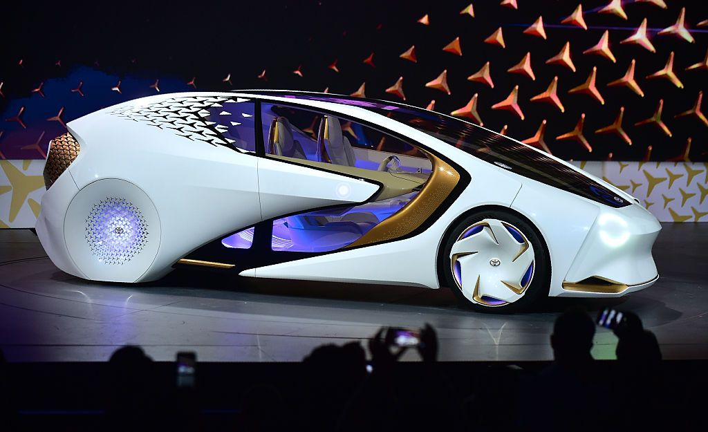
As mentioned above, Toyota's mainline American sedan is now getting a Lexus-like frontal design.  The hood face, the faux air intakes flanking the actual grille and the dark, two-level apparent grille segment do not work well together.
Read More

Thursday, May 10, 2018

Ghia's Fiat 8V Supersonic

The Ghia "Supersonic" design for the Fiat 8V of 1953 was ahead of its time, looking more like cars created five or even ten years later on.  Background on Fiat's 8V is here, and I posted on it here, featuring the factory-designed body.  This Wikipedia entry credits its design to Giovanni Savonuzzi.

Only a few Supersonics were built, but I was able to see and photograph one at Los Angeles' Petersen Automotive Museum last year.  Click on the images to enlarge.

Gallery

Front three-quarter view of the Supersonic on display the the Petersen Automotive Museum in 2017.  The hood is long and there is no bumper to dampen the styling.  The long, raised shape along the side containing a heat exhaust vent is a feature found in later Ghia-designed concept cars built for Chrysler Corporation.

An earlier car that might have influenced the Supersonic's styling was the Ford X-100 dream car that debuted early in 1952 as a "pushmobile" that became functional in 1953.  It too has jet fighter- inspired details including round tail lights.  The Supersonic might have picked up on the large (for that time) overhang and the prominent mid-side character crease.

Here is the original 1952 Fiat 8V Berlinetta, styled in-house by Fiat.  Compare the front and rear overhang with that of the Supersonic in the images below.


Note that the Petersen had an entire display zone holding only silver-colored cars.

Rear quarter view.  Again, no bumper.  The round tail light housings are suggestive of jet fighter exhausts -- part of the Supersonic concept.  The creases extending downwards form the micro-tailfins might have a structural origin (hard to say from the photos), but is the only really fussy styling element.

Hood air intakes, real and fake, were common in the early 1950s.  If the vent seen here is functional, it must be barely so.  Again, hard to tell from the photo.
Read More